
CSS3 Box-Shadow with Inset Values.
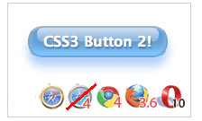
the CSS3 Aqua button is made with semantic markup and shorter CSS.
And this time, no CSS gradients! – use CSS box-shadow property with multiple inset values to draw layers of inner-shadows to create the visual effect.
inset (optional)
If not specified (default), the shadow is assumed to be a drop shadow (as if the box were raised above the content).
The presence of the inset keyword changes the shadow to one
inside the frame (as if the content was depressed inside the box).
Inset shadows are drawn above background, but below border and content.
(optional)If not specified, the color depends on the browser. In Gecko (Firefox), the value of the
color property is used. Safari’s shadow is transparent and therefore useless if is omitted. (required)
This are two values to set the shadow offset. specifies the horizontal distance. Negative values place the shadow to the left of the element. specifies the vertical distance. Negative values place the shadow above the element.
If both values are 0, the shadow is placed behind the element (and may generate a blur effect if and/or is set).
(optional)
This is a third value. The higher this value, the bigger the blur, so the shadow becomes bigger and lighter. If not specified, it will be 0.
(optional)
This is a fourth value. Positive values will cause the shadow to expand and grow bigger, negative values will cause the shadow to shrink. If not specified, it will be 0 (the shadow will be the same size as the element).
Note – The
box-shadow property has been removed from W3C CSS3 Background Candidate recommendation document.The Entire Code!
Use-moz and -webkit prefix for box-shodow to support these browsers. For Opera, there’s no need to add -o.Also, notice there are three
inset values are defined for detailed visual effects!<input type="button" class="new-aqua" value="Login">
input[type=button].new-aqua {
  width: 155px;
  height: 35px;
  background: #cde;
  border: 2px solid #ccc;
  border-color: #8ba2c1 #5890bf #4f93ca #768fa5;
  font: 600 16px/1 Lucida Sans, Verdana, sans-serif;
  color: #fff;
  text-shadow: rgba(10, 10, 10, 0.5) 1px 2px 2px;
  text-align: center;
  vertical-align: middle;
  white-space: nowrap;
  text-overflow: ellipsis;
  overflow: hidden;
  border-radius: 16px; -moz-border-radius: 16px; -webkit-border-radius: 16px;
  box-shadow: 0 10px 16px rgba(66, 140, 240, 0.5), inset 0 -8px 12px 0 #6bf, inset 0 -8px 0 8px #48c, inset 0 -35px 15px -10px #7ad;
  -moz-box-shadow: 0 10px 16px rgba(66, 140, 240, 0.5), inset 0 -8px 12px 0 #6bf, inset 0 -8px 0 8px #48c, inset 0 -35px 15px -10px #7ad;
  -webkit-box-shadow: 0 10px 16px rgba(66, 140, 240, 0.5), inset 0 -8px 12px 0 #6bf, inset 0 -8px 0 8px #48c, inset 0 -35px 15px -10px #7ad;
}
.new-aqua:hover {
  text-shadow: rgb(255, 255, 255) 0px 0px 5px;
}
References
- Safari CSS Reference by Apple Safari Dev Center
- -moz-box-shadow by Mozilla Developer Center
- CSS3 borders, backgrounds and box-shadows by Dev.Opera
No comments:
Post a Comment